At Radial Development Group we believe code is for humans. No small part of that is the visual design of an application, since design is a significant part of user experience.
When clients have a budget for design, we work closely with a handpicked group of designers whose work we love. The results are awesome.
But not all clients prioritize design or have the budget for it. Some are on a tight deadline or are building an internal tool. In those cases, we still want to build professional-looking, user-friendly interfaces. So what’s the solution?
Fortunately we have several practices and tools that help us ensure all our projects meet basic design standards.
Design is About Decisions
As Radial senior developer and co-founder Marshall Smith says, “design is about decisions.” And decisions should be consistent. Different can be confusing to users. It can leave them lost or even scare them away. But how do you ensure consistency across an app?
When we are working with designers, we are often provided with a style guide. This specifies elements from fonts, colors, to the general look and feel of an application.
Without designers, we can use a UI framework and a set of selected fonts and color palette to achieve a similarly well-designed, if less original, outcome.
UI Frameworks We Use
There are several modern frameworks used for layout and UI. Ones we have used include Twitter’s Bootstrap, YooTheme’s UIKit, and Google’s Material Design via Material UI.
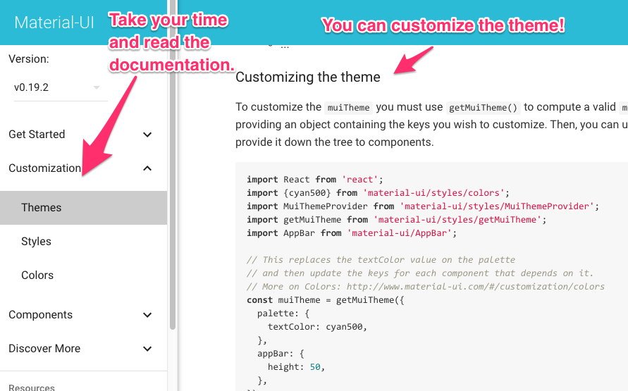
Simply including a framework in a project does not immediately guarantee good design. We always take the time to understand the design philosophy behind the framework. This involves reading through the documentation. We take time to really look at components and examples.

To the extent possible, you want to use the components the framework provides. It’s likely they have provided a solution to the problem you are trying to solve. So don’t spend forever trying to figure out how to code the CSS and Javascript to display input validation error messages when a framework has already solved that problem for you. If you find yourself trying to do something hard, you may have missed an easy way to do it that is already in the documentation. Go back and look again!
When working with a framework, we also recommend taking the time to note of the structure the framework requires. That’s something often missed by those new to a framework. Bootstrap, for example, requires container elements in order to use their default grid system.
Make Your Own Theme Or Style Guide
After that, we make sure to set up a basic style guide for colors and fonts and set Sass variables based on that guide to ensure consistency throughout the app. Many frameworks also offer the option to customize themes in advance, so you can customize the theme even without using Sass.
The advantage of these frameworks is that the components they provide offer a customizable visual consistency — something that is very important in design. They limit the amount of decisions a developer has to make while still allowing for customization. The end result? A site that feels unique to a client or a product, and follows basic design standards so it is also a pleasure to use.
This post was co-written by Marshall Smith and Stephanie Ogburn.
